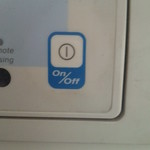
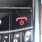
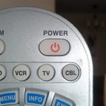
 The image on the left is the universal symbol used to represent the power button on almost any devices these days. Have you ever wondered why this specific symbol represents the power button? I did, and then I went around my apartment looking at the power button of everything that could be switched on and found it to be a very interesting exercise.
The Evolution of The Power Symbol
We didn’t always use this symbol and this was not the first time a symbol for a power button was agreed upon. Instead, there is an interesting story of its evolution. There is a reason and a purpose to the symbol. Its not something that someone just fashioned out of the blue and everyone just went along with it. The following illustrations of various styles of switches over times helps explain how the current power symbol was created.

- Step 1 – Classic On/Off Toggle Switch: This was the classic mechanical On/Off switch. One had to physically move a level left/right or up/down to switch between on & off. The two positions were marked with the words “On” & “Off”
-
Step 2 – Universal Classic Toggle Switch: As technology became more ubiquitous, the words “On” and “Off” were replaced by more universal symbols 1 and 0 where 1 represented “On” and 0 represented “Off”. Hence, we had the same mechanical switch, but with a 0 and a 1, which looked more like a line and a circle.
-
Step 3 – Evolution to a Single Push Button: With advancements in technology, it was now possible to have a single push button which could switch between on and off. Hence, we now needed a single symbol to represent that button. This symbol was created by combining the 0 and 1 where the slightly smaller 1 was fitted inside a bigger 0.
-
Step 4 – Introduction of The “Standby” State: With further advancements in technology, devices had the capability of being an intermediate state, where they were neither on or off. This state is sometime called the “standby” or the “sleep” state, which allows the device to become available for interaction very quickly, while consuming extremely small amounts of power when not in use. This required the creation of yet another symbol, which is the symbol that is now almost ubiquitous as the symbol used on power button of a device.
Source & Details: http://en.wikipedia.org/wiki/Power_symbol
Power Buttons In The Wild
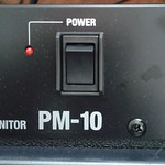
Now lets take a look at some power button in the wild, i.e. my apartment. I’m a geek so I have plenty things with power buttons. Most devices use the standard symbol from Step 4 but there are quite a few other styles used as well, including styles based on Step 1 to Step 3
Click on the picture to see more details
Style 2 Switches – Old Is Gold! Some Devices Keep It Classic
It was interesting to see that some devices still employed the Step 2 style power buttons. They are straight forward to use, mechanically simple and less prone to failure.
Style 3 Button – Very Rare But Exists!
I was very surprised to find a style 3 symbol on this Nokia Phone. The ironic thing is that the button in the picture below actually performs a host of operations. Not only does is do on/off/standby, it is also use to switch between a loud/silent/vibrate profile. It seems like the wrong symbol to use for a button that does so much!
Style 4 Buttons
All these buttons should look very familiar to you. Most of the devices in my home had buttons like this. In fact, I intentionally didn’t take picturs of the all such buttons since others were more interesting!
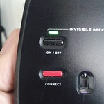
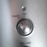
Switches With Lights
I also found that thre is a whole category of switches that don’t use the power symbol at all and use a small light to indicate whether the device is on off. This also allows them to get a bit creative with the actual switching mechanism.
Switches With Auditory Signals
The following is the power button for my set of Wireless Bluetooth headphones. Hence, unlike normal headphones, they need to be switched on to use and switched off when not in use to save battery. However, once you have them, you can’t see them. The headphones do provide an auditory cue to being switched on an off.
The headphones, however do also have a small light outside to provide a visual cue as well.
The Apple Way
By far the most interesting power button design was that of Apple’s iPhones, iPods & iPads. This single buttons does a lot including powering on the device and taking it out of standby mode.
However, the symbol that they used is basically an outline of a single icon on the home screen. Here, Apple has raised the user to a higher level of abstraction. The user no longer actively turns it “on” or “off”. The user simply interacts with the phone as need be.
This may seem obvious, but I have three other phones, one from Nokia, Samsung and RIM, that actually have power buttons with the universal power symbol symbols. Apple, as always simply go their own way.
